Graphical Analysis
From Business Process Management, BPM and Workflow Automation Wiki | BizAgi BPMS
<keywords content="keywords">
graphical analysis, graphics
</keywords>
Contents |
Graphical analysis
This functionality enables analysis of the data extracted from custom searches by means of QueryForms, facilitating the understanding of the information in a quick and flexible manner, guaranteeing that people from different levels of the organization will have simple access to updated, accurate data to concentrate on the observation of tendencies, problems, opportunities, and by means of the analysis, make strategic business decisions with the information in real time.
The presentation of graphics along with the data enables the analysis of the information. It allows the evaluation of relationships within the selected variables, where the user can combine and filter the variables on two axes. Users can change the data easily, presenting the information in a custom form depending on the needs.
How to Make the Graphic Analysis
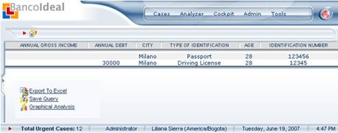
1. Once the Query Forms has been defined in Bizagi Studio and it has been executed, its results are presented in accordance with the criteria defined.
2.Click on the Graphical analysis link that appears at the bottom of the form with the search results.
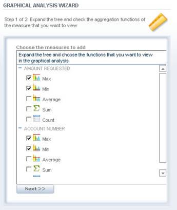
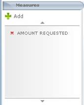
3.In the Graphic Analysis Wizard window, in step 1, the measures that will be displayed.
Measures: The measures represent any quantifiable or measurable aspect of the dimensions. Usually the measures are represented by detailed and numeric values for each dimension.
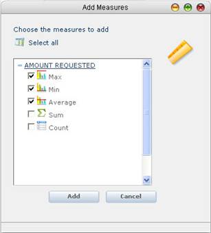
For the measures you would like to add for the analysis, at least one aggregate function must be selected to be applied.
|
Note:With the results obtained from the queries, each column is automatically classified in accordance with the type of data in measures. The numerical attribute columns (int, Money, etc.) are defined as measures. Remember that only the fields that were checked in the query to be displayed in the results will appear on the list. |
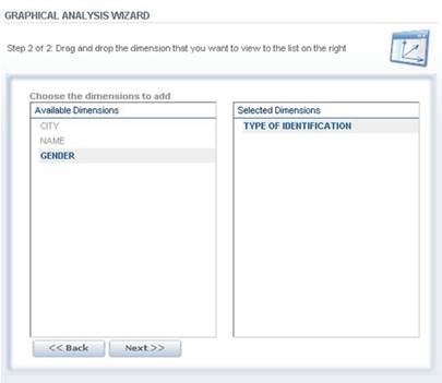
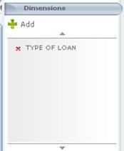
4.In the Graphic Analysis Wizard window, in step 2, select the dimensions that you would like to display.
Dimensions: The data to be measured. They represent attributes that are not numerical, which are usually descriptive data or dates, and they are used to arrange and classify their values based on the groups obtained.
To copy dimensions to the list of selected dimensions, drag and drop them there.
|
Note:The dimensions are the fields that were checked in the query to be displayed in the results that are not numerical; they are usually descriptive data such as name, city, region, dates. |
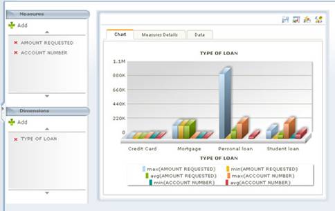
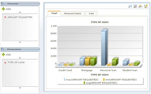
5.The result of the graphic search presents the following elements:
Measures: The list of measures selected in the graphic analysis wizard is displayed.
Dimensions: The list of dimensions selected in the graphic analysis wizard is displayed.
|
Note:For the graphic analysis of the queries resulting from the query forms in the application entity, there are additional measures and dimensions of process data, such as: case creation date, case solution date, final status, amount. |
Configuration Menu
It provides functions to save the analyses, export to Excel, the display of the result tables and graphics.
![]() Save Graphical Analysis: this option saves the graphical analysis generated.
Save Graphical Analysis: this option saves the graphical analysis generated.
![]() Export to Excel: Enables the user to export the result tables to excel.
Export to Excel: Enables the user to export the result tables to excel.
![]() View chart and data: This functionality enables you to view the data presented in tables in the graphic tab at the bottom of the graphics.
View chart and data: This functionality enables you to view the data presented in tables in the graphic tab at the bottom of the graphics.
![]() Group chart by: this option enables you to show the graphics in accordance with the existing dimensions and it is represented with division lines that group together the result of the query for the dimension that has been defined.
Group chart by: this option enables you to show the graphics in accordance with the existing dimensions and it is represented with division lines that group together the result of the query for the dimension that has been defined.
![]() Chart Type: This functionality enables you to select the type of graphics to be displayed. Line 2D, Columns 2D, Columns 3D, stacked columns 2D, stacked columns 3D, Area 2D, pie 2d, pie 3d, Doughnut 2d, Doughnut 3d,
Chart Type: This functionality enables you to select the type of graphics to be displayed. Line 2D, Columns 2D, Columns 3D, stacked columns 2D, stacked columns 3D, Area 2D, pie 2d, pie 3d, Doughnut 2d, Doughnut 3d,
Tab Chart
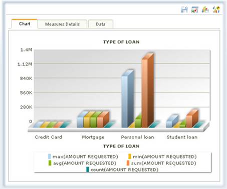
This element presents the query results in a graphic fashion. The types of graphics displayed on this tab are Line 2D, Columns 2D, Columns 3D, stacked columns 2D, stacked columns 3D, Area 2D,
The graphics are constructed taking into account the dimensions and measures selected. The data that are not quantifiable or dimensions that characterize the information constitute the X-axis, which are used to arrange and group together the values. In addition, the values calculated for the measures depending on the aggregate function used constitute the Y-axis.
|
Note:Depending on the type of dimension, the type of graphics is defined automatically. Bar-type graphics are normally used, but if a dimension has been selected and it is Date type, a linear graphic is used to represent the timeline. |
Tab Measures Details
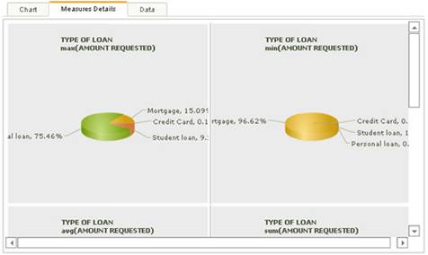
This element presents the query results graphically, for each aggregate function of the measures that were selected. They types of graphics displayed on this tab are pie 2d, pie 3d, Doughnut 2d, Doughnut 3d,
Tab Data
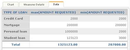
Result tables arrange the information depending on the dimensions selected and display the resulting values of the measurements in accordance with the aggregation functions defined in the columns.
How to Mark or Unmark New Aggregate Functions to the Measures
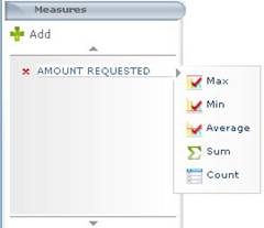
1.In the Measures element of the graphic analysis, select the measure that has already been added and the aggregate functions available are displayed.
2.The functions applied appear on the list of functions with the symbol of approval. When you select a function, the function is applied for the analysis. Likewise, when you select the functions that have been applied, they are no longer applied for the analysis.
How to Add Measures to Carry Out the Graphic Analysis
1.In the dimensions element of the graphic analysis, click on the Add option. The Add Dimension window is displayed.
2.In the Add Measures window, you will see the list of fields that were checked in the query to be displayed in the results that are numerical.
When the tree of each measure is displayed, the aggregate functions are shown. You can select the functions of the measures you want to apply for the analysis.
3.Click on the add button. The information is updated automatically.
How to Add Dimensions to Carry Out the Graphic Analysis
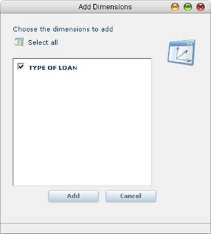
1.In the dimensions element of the graphic analysis, click on the Add button. The Add Dimensions window is displayed.
2.In the Add Dimensions window, you will see the list of fields that were checked in the query to be displayed in the results that are NOT numerical. The user can select all the dimensions by making use of the “Select All” link or selecting dimensions by clicking on the check to the left of each dimension.
3.Click on the Add button. The information is updated automatically.
<comments />
