GetSummaryForms
From Business Process Management, BPM and Workflow Automation Wiki | BizAgi BPMS
<keywords content="keywords"> GetSummaryForms, getsummaryforms, Get Summary Forms, get summary forms, SOA Layer, soa layer, RenderSOA, rendersoa, Render SOA, render soa </keywords>
Contents |
GetSummaryForms
A method from the RenderSOA web service that helps obtaining the fields and values of a form configured as the process’ summary form.
Description
This method receives an XML in string format which contains the case number and, because this form is shown for pending cases, also the identification number of the workitem. The return message is an XML in string format.
Input Data
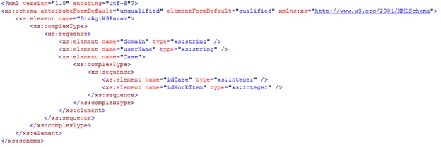
The expected XML has the following schema:
Parameter 1 (String Type)
BizAgiWSParam: Root node.
domain: Domain of the Bizagi user.
userName: Name of the Bizagi user.
Case: Includes information about the case and the desired workitem.
idCase: Case identification number.
idWorkItem: Identification number of the instance of user task to which the form belongs.
Example
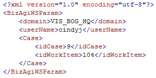
The following XML will be used to obtain the summary form of the workitem with id 104 on case 9:
Output Data
The returned XML varies according to how the form was built up and on the renders it contains. Here is the description of each data the response may contain in the returned XML.
Elements
BizagiResponse: Root node.
Form: Contains the data of the form.
Tab: Indicates a tab in the form.
Group: Indicates a group in the form.
ExtendedText: One of the field types in Bizagi which is a box for large texts.
Text: Text box in a form (see field types).
ComboBox: This field type is a drop-down list in the form.
Option: This element is used with combo boxes, if the combo box is editable there will be one of this for each possible choice in the drop-down list; if it is not editable, there will only be one with the one selected.
RadioButton: Another field type that shows different options to choose from.
Item: This element is used either with RadioButton or GridSM. For radio buttons and Item element is included for each different possible choice. On GridSM is included inside a Row element and represents the value of each column in the row.
Money: Render used to show an attribute of type Currency, (see field types).
Numeric: Render used to show any other attribute representing a number (integer, float, real, etc.), (see field types).
YesNo: This field type is use for Boolean attributes and is a pair of Yes/No radio buttons.
Date: Represents a date and time field type.
SearchDialog: Represents either a Join Search Dialog or a Join Search Field (see field types).
Actions: Set of actions configured for the render.
Action: A particular action.
Behaviours: Set of behaviours configured for the render.
Behaviour: A particular behaviour.
ClientValidations: Set of validations configured for the render.
ClientValidation: A particular validation.
Expression: This element is used for actions, behaviours and validations. It contains the expression that is evaluated.
Target: Element use in actions which includes exactly the actions for the target.
GridSM: Used to indicate a grid (or table) which is a render for Collections.
DisplayForm: This element is part of GridSM and wraps the renders (columns) of the table.
AddForm: Also part of GridSM, contains the identification number of the form used to add a new row on the table.
EditForm: Also part of GridSM, contains the identification number of the form shown when a row is edited.
Values: Part of GridSM, contains all the rows in the table.
Row: Part of Values, this element indicates a row in a table (grid).
CaseInfo: Case information.
IdCase: Identification number of the case.
IdWorkItem: Identification number or key of the instance of the activity.
RadicationNumber: Alphanumeric value corresponding to the creation number of the case.
SolutionDate: Date in which the case was fulfilled.
Creator: Information about the creator of the case.
Id: Identification number of the creator.
UserName: Creator’s user name.
Domain: Domain to which the creator belongs.
FullName: Complete name of the creator.
Activity: Information about the consulted activity.
Id: Identification number of the task.
Name: Name of the task.
DisplayName: Task’s display name
Description: Short text with some description of the task.
Process: Data about the process.
Id: Number which identifies the process.
Name: Process’ name
DisplayName: Text with some explanation about the process.
Attributes
Attributes belong to Elements and not all attributes are found in every element. Here is a short explanation of the ones that may be found.
RenderId: Identification number of the render, this attributes is included in all elements that represent a type of field: Form, Date, Combo Box, Text, etc.
ConfirmationRequired: Belongs to the Form element and is a Boolean indicating if when the Next button is clicked, the activity needs user confirmation.
DisplayName: Almost all elements have this attributes, this is the text that should appear for a field if it is shown.
Editable: All elements corresponding to field types (except GridSM) have this Boolean attribute which indicates if it should be shown editable or not.
Required: Like the previous one, this one is a Boolean which indicates if a render should be shown as required or not. It can be found all field types elements, except GridSM and Form.
XPath: Contains the mapping of the render to the data model, every field type render has it except Form.
Description: This attribute appears for elements representing a field type only if a description text was included in the render properties.
HelpText: Like the Description it only appears if this information was filled in the render properties.
LabelAlign: Text specifying the alignment of the render label (left, center, right or justify).
LineBreak: A Boolean indicating if after this render there is or not a line break; that is to say if the next render is on a new line or on the same line.
ValueAlign: Text specifying the alignment of the render value (left, center, right or justify).
DisplayOption: Some renders have the different options of displaying, these options are: both, which is the default option, shows the label and next to it the value; label, shows only the label of the render; value, shows only the value of the render; reversed, shows first the value and next to it the label; and vertical, which shows the value beneath the label, in a new line.
ColSpan: A number indicating the number of columns a render uses, usually this number is zero (0).
Retype: This attribute can be found in some elements that represent field types and it is a Boolean indicating if the data entered in this render must be type twice or not.
Size: It is a number indicating the size of the box to enter values for field types: text, extended text and money. It may be also found in combo boxes and it will have a number different from one (1) if the render must be drawn as a list, this attribute indicating the size of the list box, instead of a drop-down list.
MaxLength: Attribute used for elements Text and ExtendedText which indicates the maximum number of characters that can be type into the render.
ColSize: Only for ExtendedText element, it is a number indicating the horizontal size of the render, if the number is 0 then it has the default value which shows 42 characters.
ResetAppearance: This one is found in the elements Action and Behaviour; it is a Boolean which indicates if the render has to return to its original appearance if the condition no longer is met.
Show: It is also part of the Behaviour element and for actions it is included in the Target element. This Boolean determines if the render, to which the Behaviour belongs or to which the Target refers, is visible or not.
Color: Attribute found in the Behaviour element and in the Target element that is part of the Action element. It is the hexadecimal code of the color in which the render should be shown if a condition is met.
OrderAttrib: It may be found on ComboBox, GridSM or SearchDialog elements. Contains the name of the attribute that should be used to order the elements these fields contain.
SubmitOnChange: It is a Boolean that can be found on several field type elements to indicate if the form is submitted when the value of field is changed.
Value: This attribute is included in most field type elements and contains the actual value of the field, if it is not found this means the field has no value at the time. It is also part of the Option element of combo boxes, containing the key value of the register.
Text: It is the text that is shown on drop-down lists, this is the value on the display attribute for an entity; it is included in the element Option.
AdditionalText: For a drop-down list is possible to include a second text corresponding to the value of any other attribute in the entity. This attribute is for the Option element.
Message:
IdDisplayForm:
IdRelatedEntity:
DisplayValue:
RelationDisplayName:
AllowAdd:
AddLabel:
AllowDelete:
EntityDisplayName:
Example
View here (right-click Open in New Window or Tab) the XML in response to the one send as example:
Go to SOA Layer <comments />


